
Arezou Bhabha
Project Manager, Graphic Designer, Game Developer
Project Manager, Graphic Designer, Game Developer
TopInc Print Imagination
Working in graphic design, prepress, and production planning while driving new business initiatives and operational improvements. In addition to producing print-ready artwork and managing client communication, I spearheaded the launch of a new sublimation and custom apparel printing division from concept through implementation.
RM Graphics
Handled projects from initial sale through design, client approval, and final production. Operated large-format and small-format digital presses while managing client accounts.
RM Graphics
Managed high-value accounts for large-format signage, including vehicle wraps, and storefront installations. Operated and troubleshooted a wide range of digital press equipment, including a 1.6m large-format printer and high-volume small-format copiers.
RM Graphics
Serviced walk-in and WhatsApp clients, identifying their needs and recommending the appropriate print media. Managed the order pipeline from approach to invoicing, ensuring timely delivery.
Wherever they might be and whatever they may entail, I am a multi-talented creative committed to delivering effective, exciting and engaging solutions.
From interactive mall kiosks to launching an entirely new product range from scratch, I have done it all.
With over five years of experience in the print and design industry, I have developed a strong skill set in project management, graphic design, game development and sales.
My background allows me to approach projects with an advanced understanding of both the creative and technical aspects paired with a neverending passion to see it through.
Come take a look around,
I am certain I have a solution waiting for you.
I identified an opportunity to expand beyond traditional print services by introducing sublimation and custom apparel printing. I was responsible for researching, planning, and implementing the new product line, from validating the business case to establishing production workflows and pricing models.
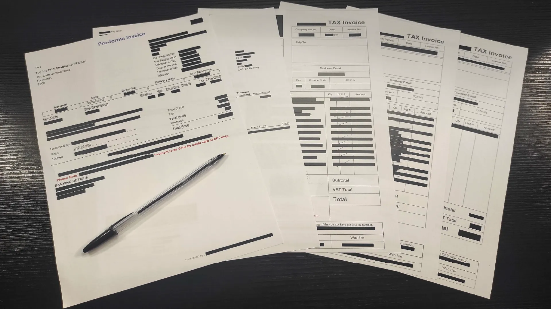
The first objective was determining whether the new product line was commercially viable.
Market Research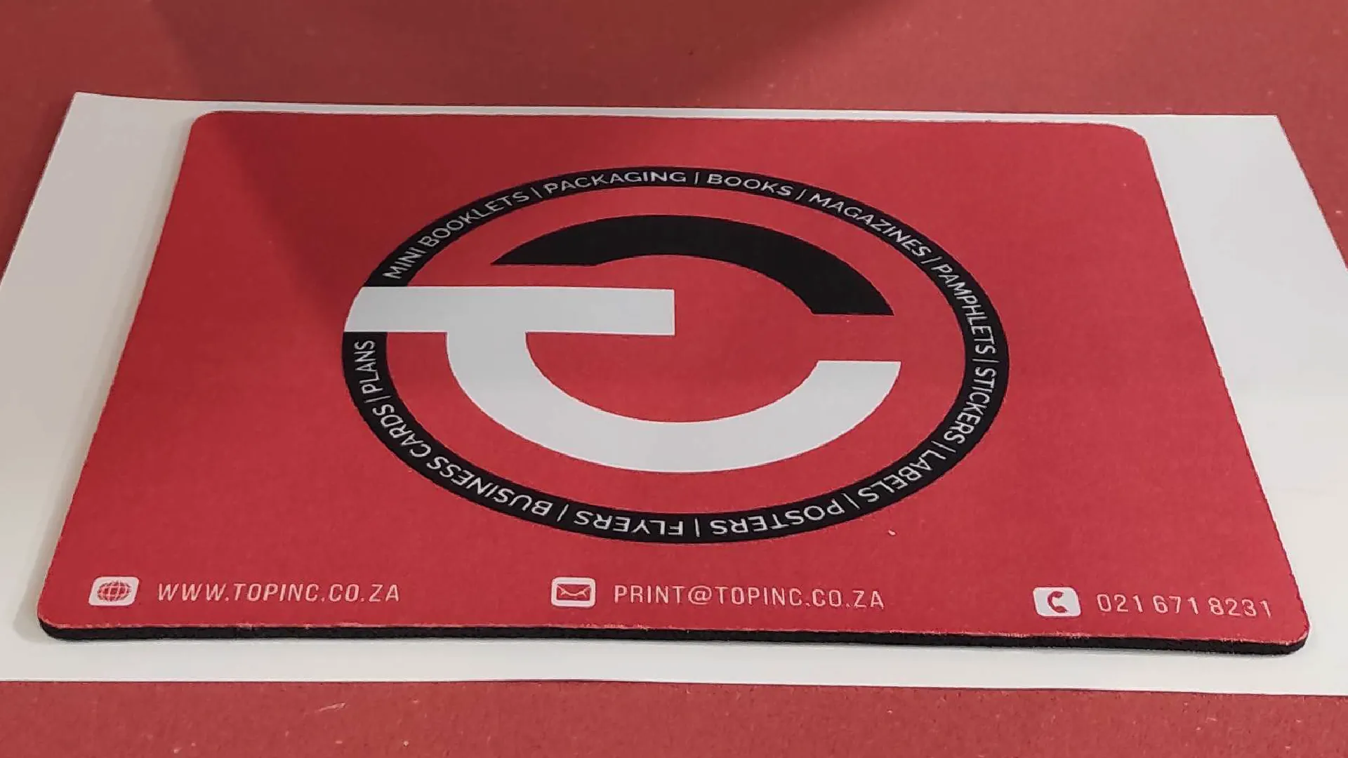
Once the business case was approved, the focus shifted to building an efficient production environment.
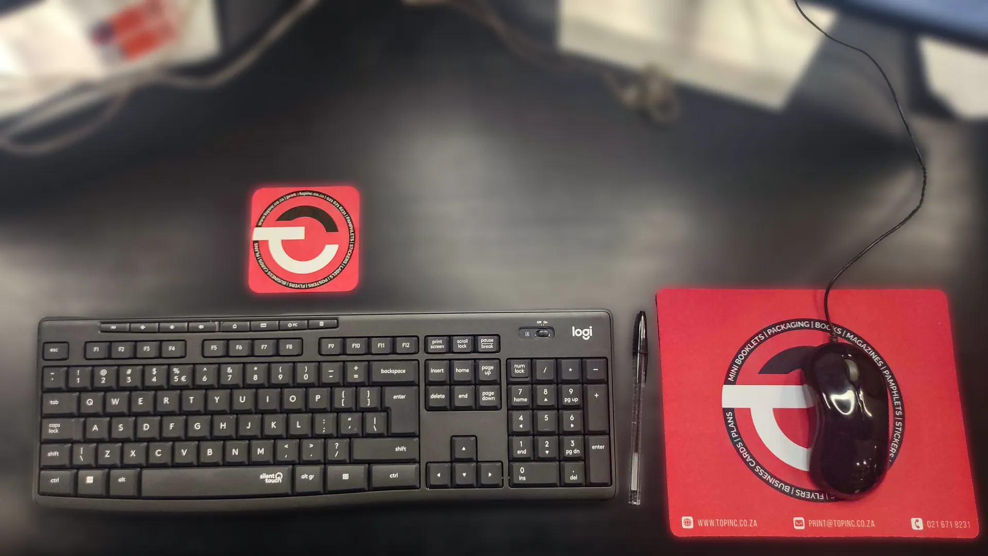
The final stage focused on implementing the new production capability and preparing it for commercial operation.
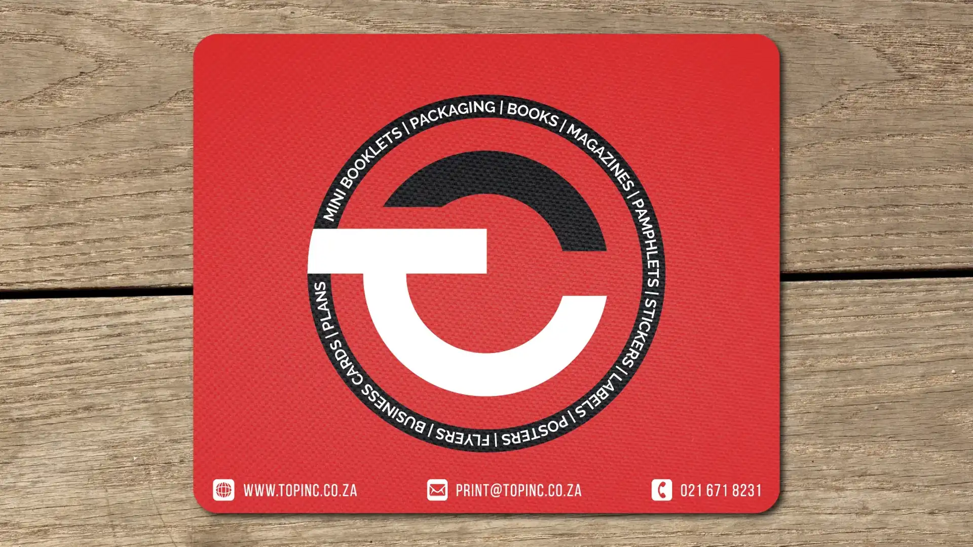
Launching the sublimation and custom apparel division demonstrated that introducing a new production capability involves far more than purchasing equipment. Success depended on balancing commercial viability, operational efficiency, supplier reliability, and production quality before the first customer order was accepted.
By completing detailed cost modelling and market analysis before investing in equipment, the business was able to make informed purchasing decisions, establish profitable pricing structures, and avoid common startup mistakes such as underpricing products or underestimating production costs.
The project also produced a repeatable framework for evaluating future product lines, with documented costing models, supplier comparisons, pricing tools, and production planning processes that can be adapted for additional services.
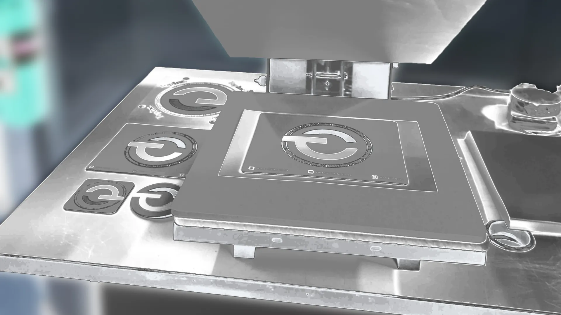
Small consumables, such as transfer tape, protective paper, gloves, cleaning materials, and expected wastage, can have a measurable impact on profitability. Accurate costing requires accounting for every input rather than focusing solely on the primary materials.
Machine specifications rarely reflect real-world output. Timing complete production cycles highlighted bottlenecks in preparation, pressing, cooling, and packaging that ultimately determined realistic production capacity.
Equipment cost is only one factor. Local servicing, warranty support, spare part availability, delivery times, and supplier responsiveness often have a greater long-term impact on operational reliability than the initial purchase price.
Building break-even analyses, margin calculations, and payback forecasts before purchasing equipment made investment decisions objective rather than relying on assumptions.
Assessing workspace layout, electrical requirements, and production flow before installation avoided disruptions and ensured the new equipment could be integrated into the existing operation efficiently.
Recording pricing models, production processes, and supplier information created systems that are easier to repeat, train, and improve over time, reducing reliance on individual knowledge.
The project reinforced that successful product launches require balancing customer expectations, operational constraints, profitability, and long-term sustainability. Every decision, from equipment selection to pricing strategy, has downstream effects on production efficiency and commercial success.
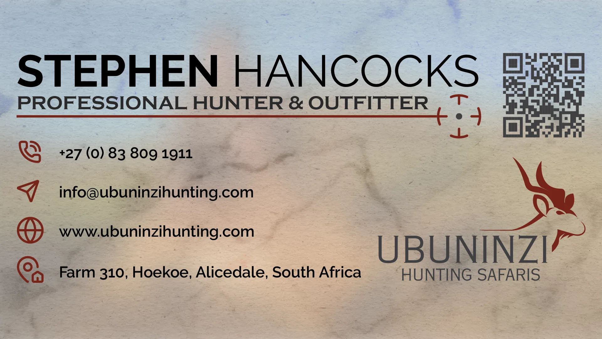
I was tasked with bringing the branding of Ubuninzi Hunting Safaris to the modern age, while still keeping it grounded with the hunt.
The client had a few references of their old branding, images to be used within the design, and some ideas
as to what they would like.
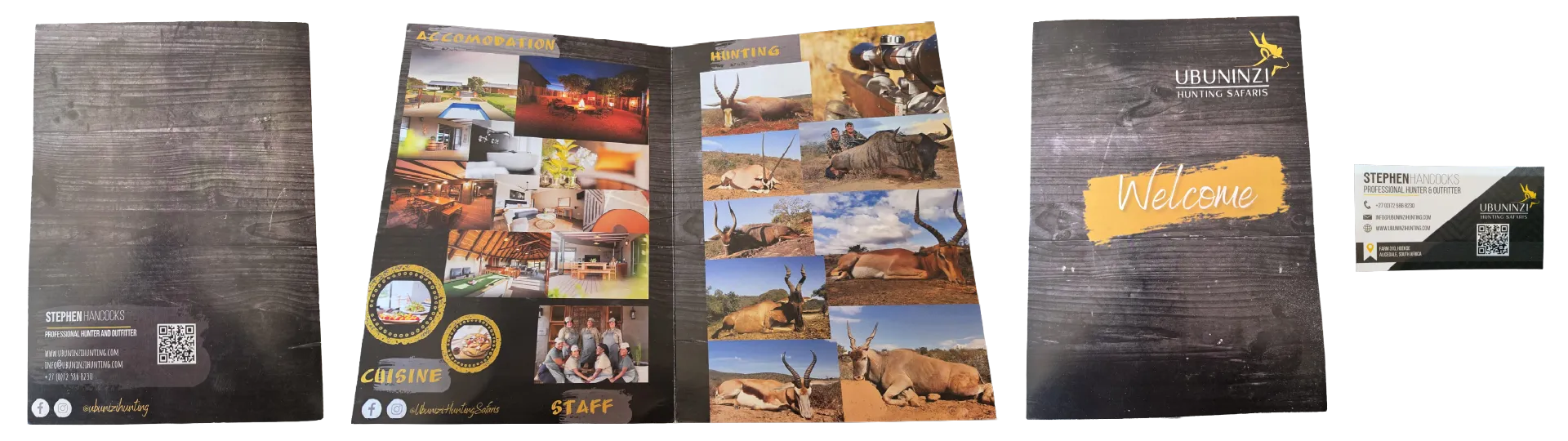
Immediately I thought, we can make the folder stand out.
Instead of a plain cut on the folders, what if we made the cut flow into the identity of the brand?
The business cards should carry the texture of what its like to be on the ground, sights on target.
With a vision in mind, I made my thoughts a reality.
I ran through samples internally. I knew wanted to make my first design, the design that gets approved.
Mininal changes, I send in my designs and await feedback.
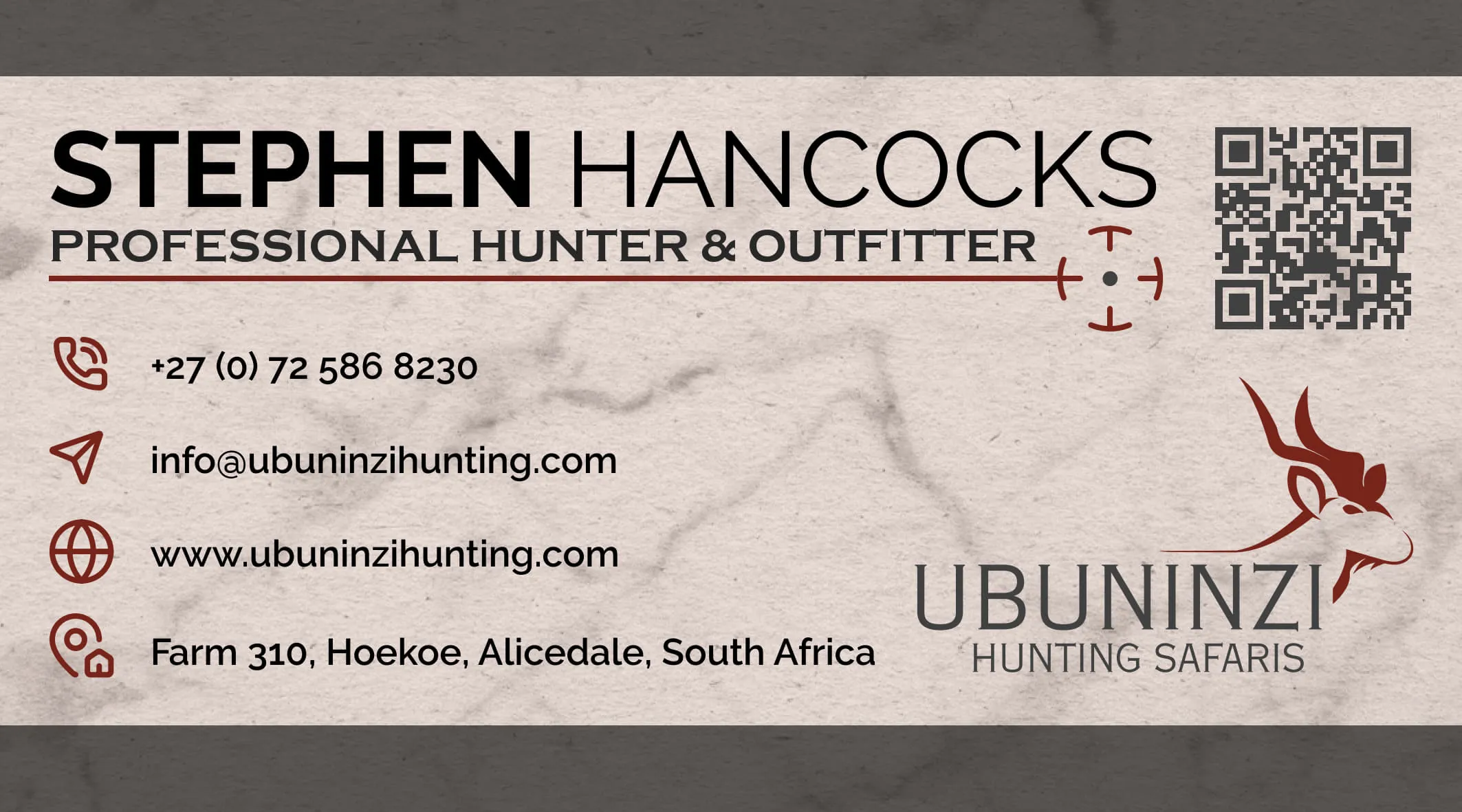
I have received the good news, "Thank you so much – I am very happy with the design."
Just a quick change to update a phone number, and to swap a photo with a new one they supplied.
We could now move onto production and see our final work.
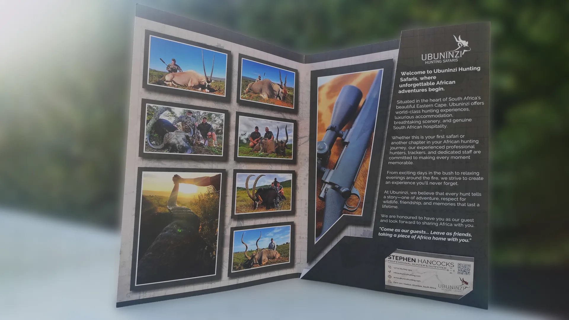
The client had a plethora of resources, a brand guide and previous designs.
Everything one would need, except time...
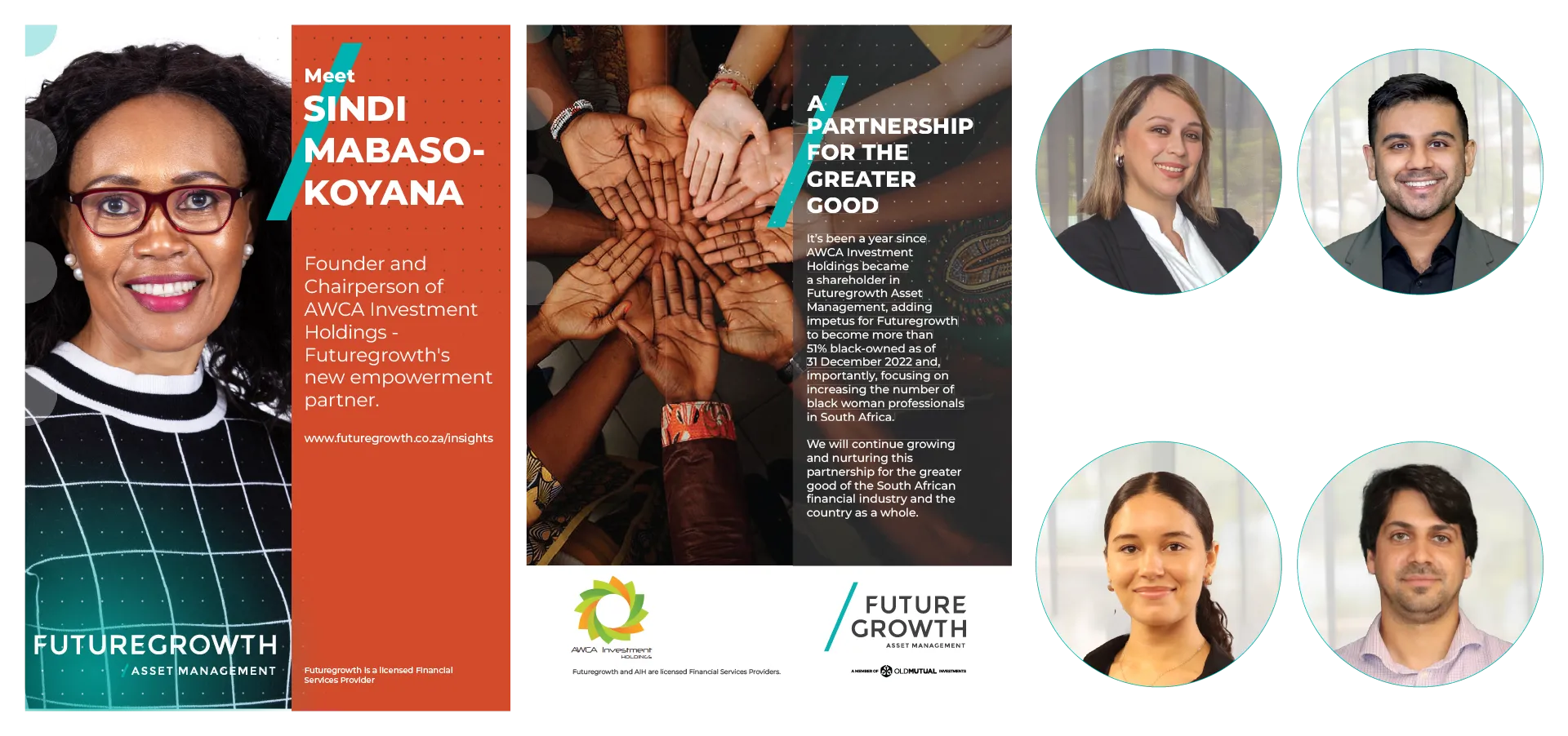
Okay, I've got everything I need.
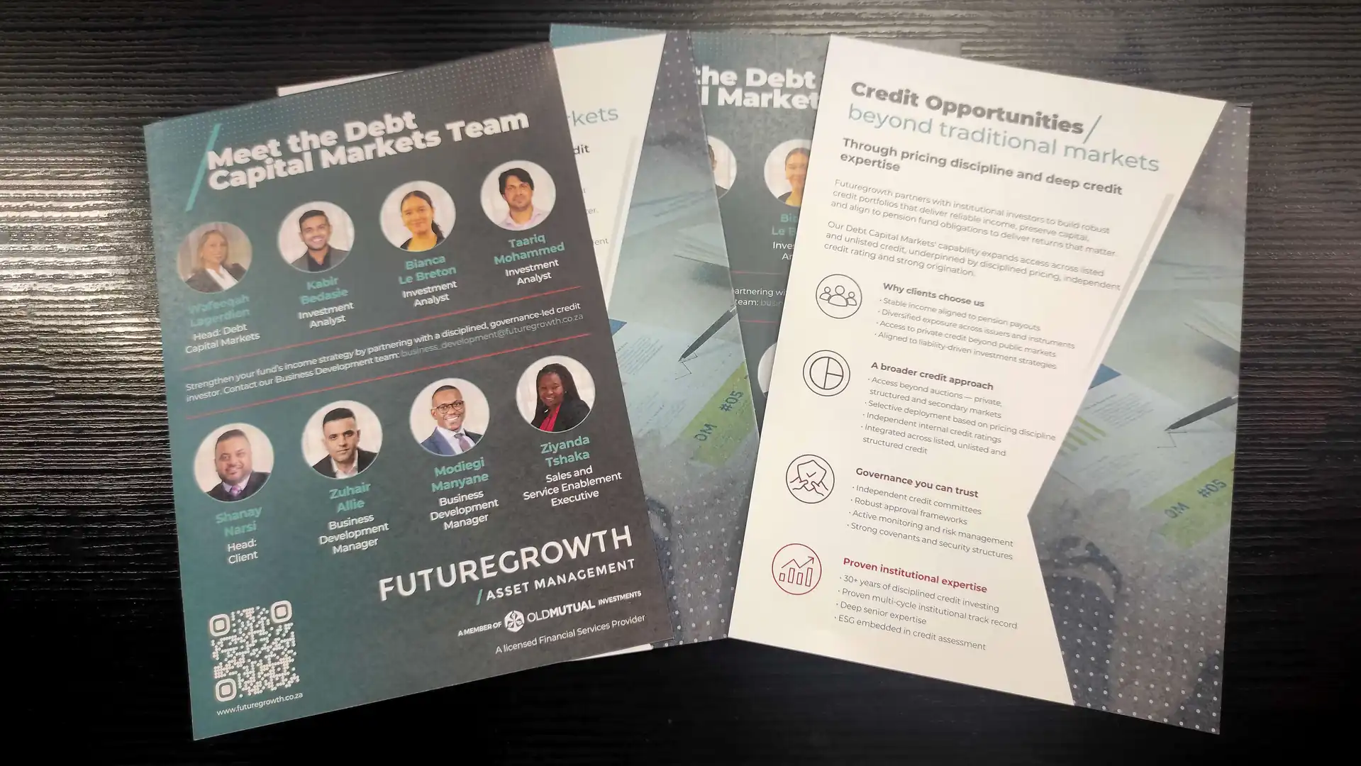
I knew I did not have time for back and forth, so I made my first design, the design that gets approved.
The job had to get printed on time, an approval had to come even sooner.
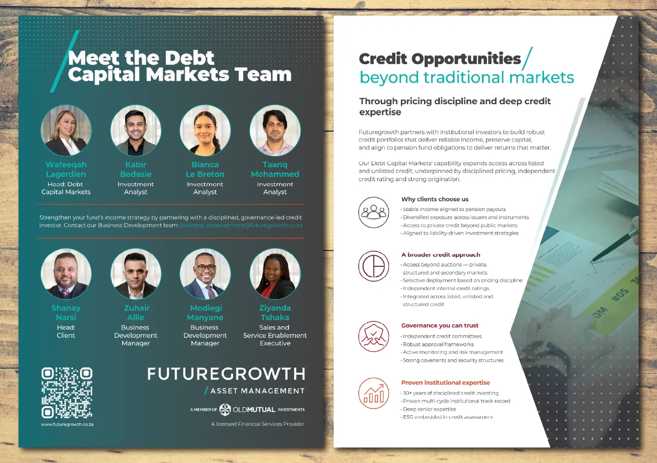
Luckily, the only changes that had to be made were minor name alterations.
We were onto production with time to spare and a happy client.
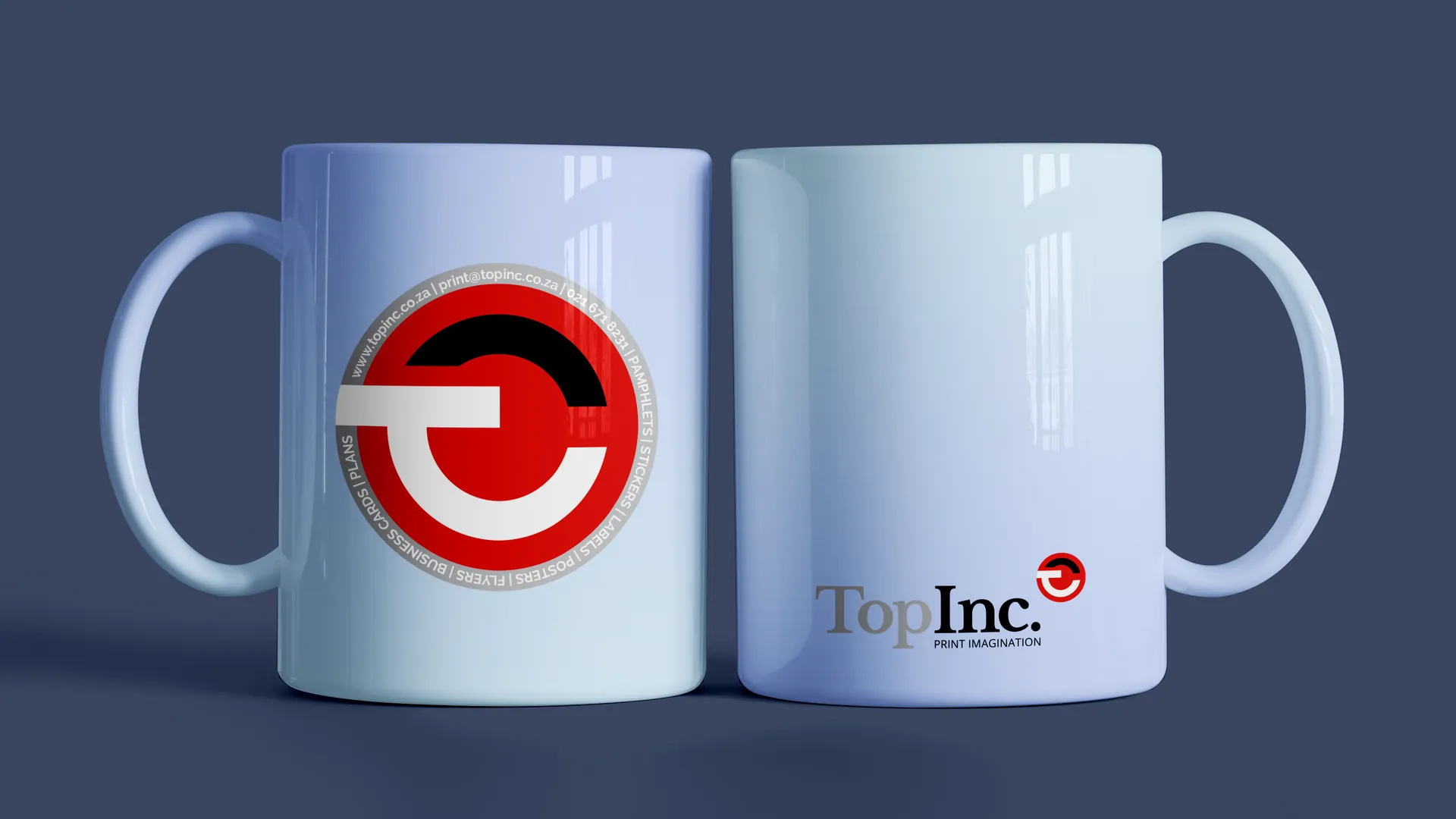
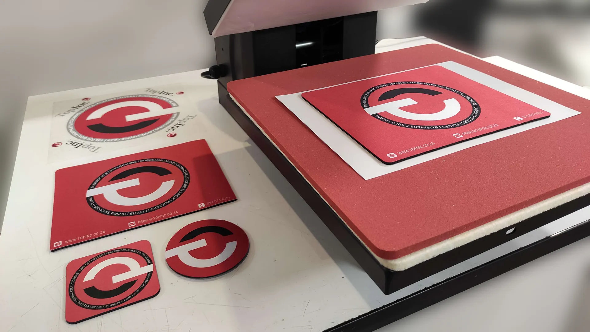
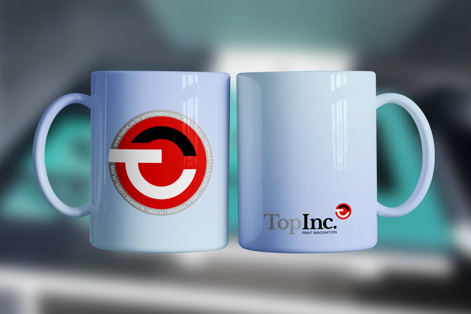
As part of launching our sublimation printing service, I was responsible for developing product designs suitable for a wide
range of promotional and personalised items.
While the accompanying project management case study covers the planning and implementation of the new product line,
this entry focuses on the creative process behind designing for sublimation.
Designing for sublimation requires a different approach from traditional print work.
Every product has its own printable area, viewing angles, bleed requirements, and physical limitations.
Before beginning artwork, I built templates for each product, ensuring designs would transfer accurately to mugs,
mousepads, coasters, apparel, and other promotional items.
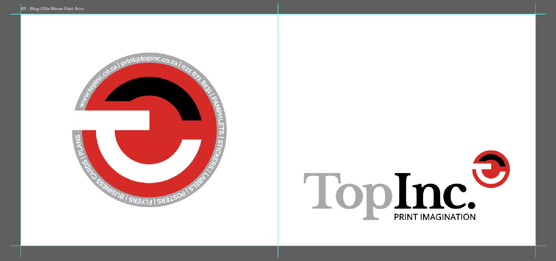
Rather than create one-off graphics, I wanted to create reusable (to scale)
that allowed future customer orders to be produced quickly while maintaining consistent quality.
Throughout the process I considered color vibrancy after transfer, image resolution,
safe margins, and how the final product would actually look like in everyday use.
This was the most important phase, we had to make sure that we had a consistent design-to-production workflow.
Several tests were done to ensure good color consistency, sizing and placement across all products.
Once I was happy, I knew I set the stage for a consistent sublimation workflow.
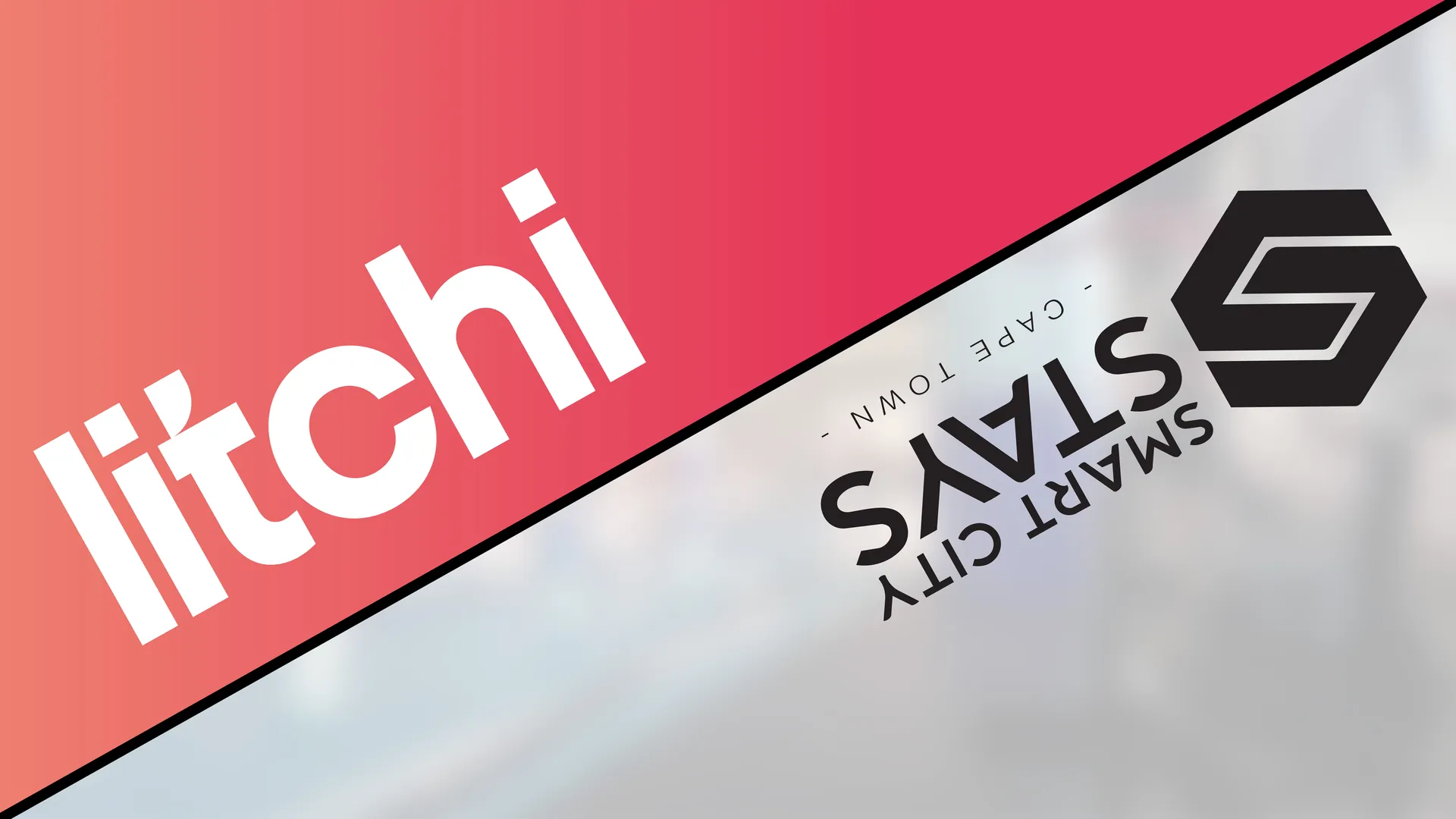
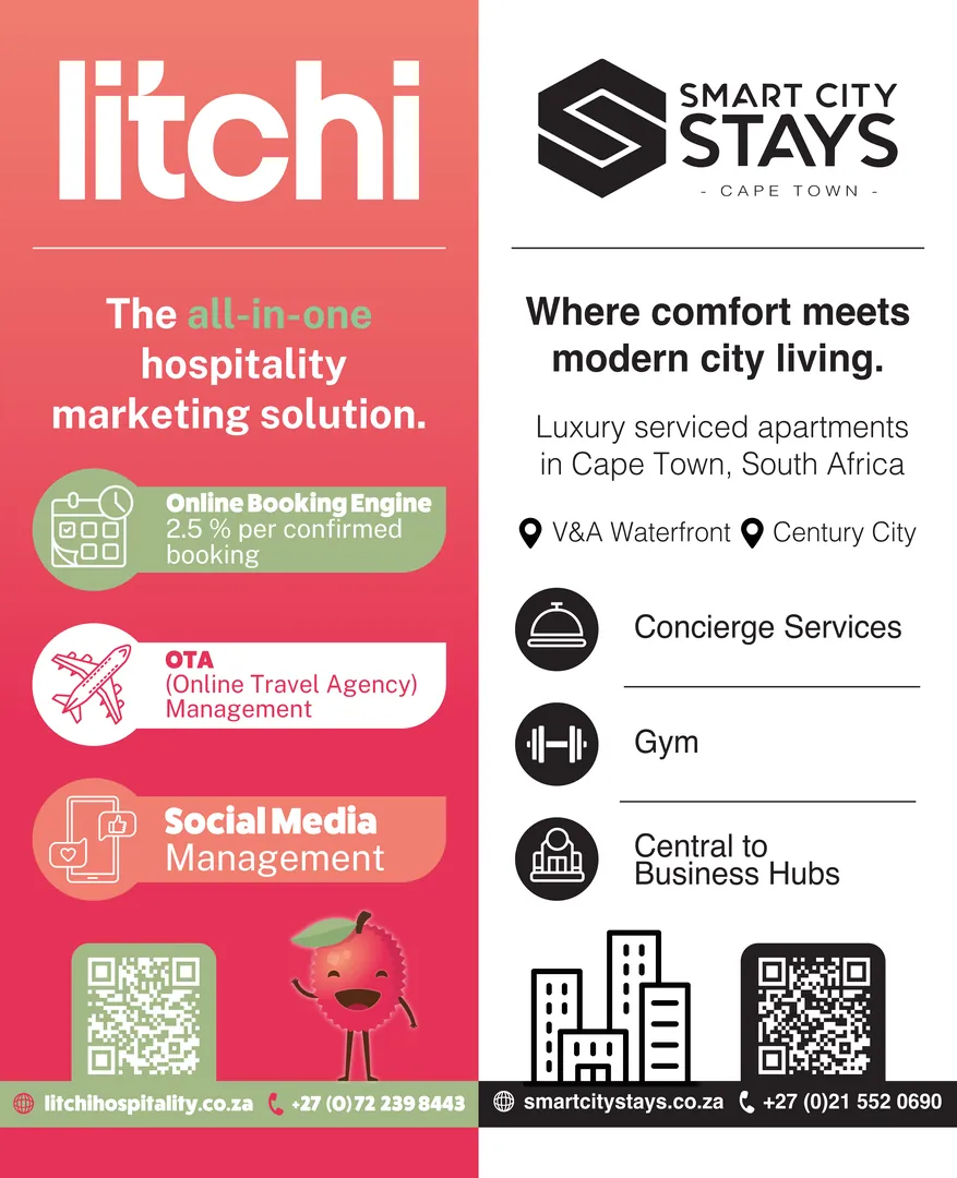
Litchi Hospitality already had an established visual identity that I'd worked with before, complete with brand elements and colours.
Smart City Stays, on the other hand, arrived with only a low-resolution logo and a list of information that needed to be included.

With exhibition graphics, readability is paramount.
Rather than trying to force both brands into one visual identity, I split the banner into two complementary halves.
Each company retained its own colours and personality while sharing a consistent structure that made the banner feel like one cohesive piece.
Icons, spacing and typography were used to organise what was a fairly text-heavy brief into something visitors could scan from a distance.
The result stayed clean, corporate and modern, while naturally guiding the eye to the relevant information.
The first proof was well received, with only content updates requested.
Litchi's service list was adjusted to include updated booking commission details and revised service names,
while Smart City Stays simplified their feature list to focus on the amenities most relevant to exhibition visitors.
The final artwork maintained its clean flow despite carrying a significant amount of information and was supplied for print.
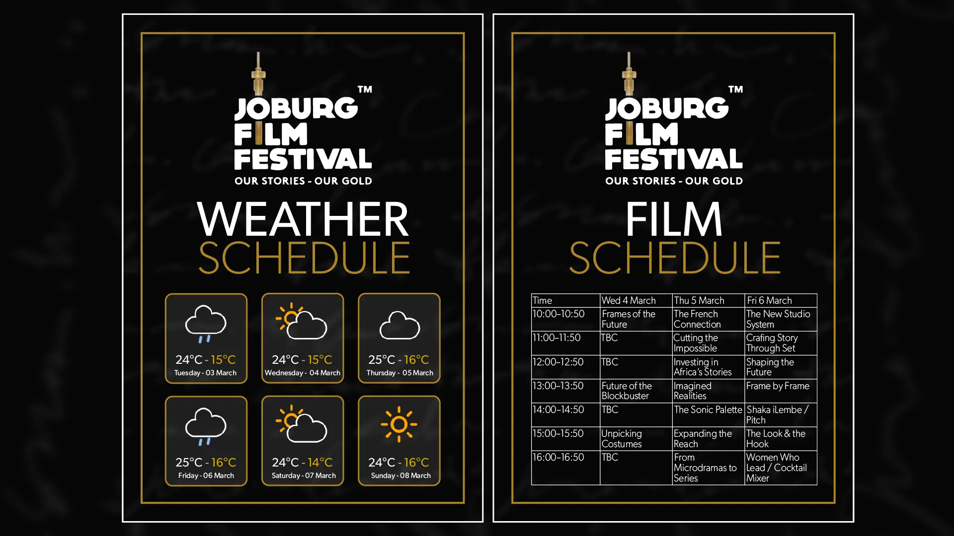
The request came through late in the morning with a same-day deadline.
The deliverables were two A4 portrait information boards:
One displaying the festival schedule and another showing the week's weather forecast.
The only supplied assets were a low-resolution logo lifted from the festival website and an Excel spreadsheet containing the programme.
Everything else had to be designed from scratch.
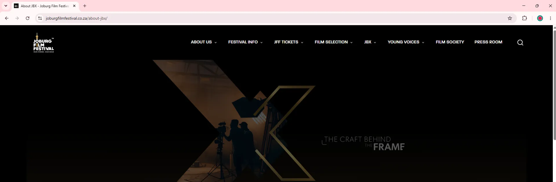
The brief called for something "minimalist" and "sleek" while remaining editable, as several programme items were still marked TBC.
I began by recreating the festival's visual language using the black, white and gold palette from the Joburg Film Festival branding.
The low-resolution logo was cleaned up as much as possible before becoming the focal point of both layouts.
For the schedule board, the challenge was fitting an entire multi-day programme onto a single A4 sheet without sacrificing legibility.
A balanced table structure, consistent spacing and bold typography kept the information easy to scan, still leaving room for any last-minute edits.
The weather board followed the same thought process, replacing dense tables with forecast cards that made the week's conditions readable at a glance.
With only a few hours between brief and deliverables, I knew there was no room for revisions.
The layouts were created around editable tables and easy to adjust text boxes, leaving the client an easy way to make any suprise changes that may arise.
Despite the tight deadline and limited artwork, the final designs naturally flowed with the festivals identity.

Stay tuned.
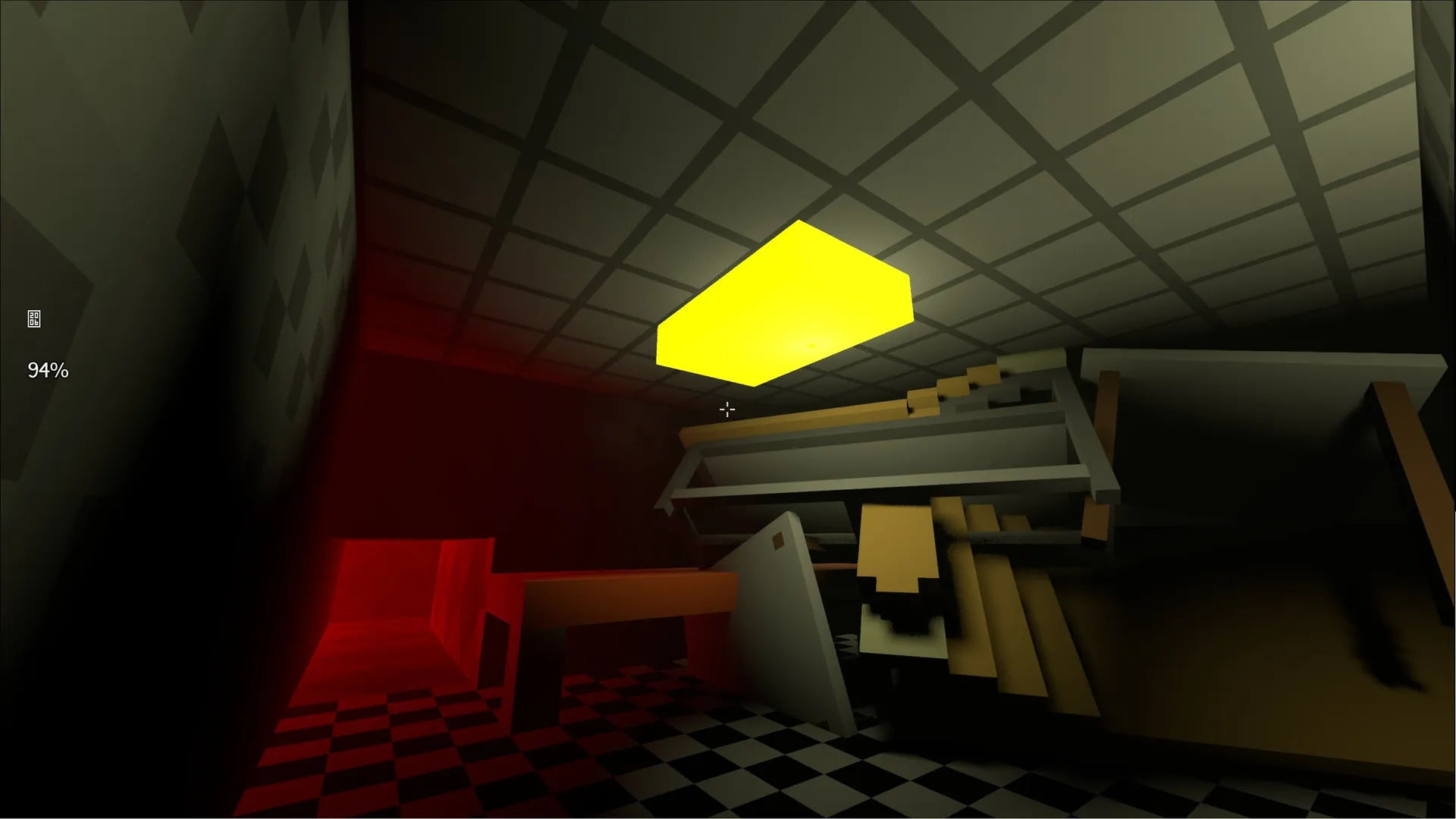
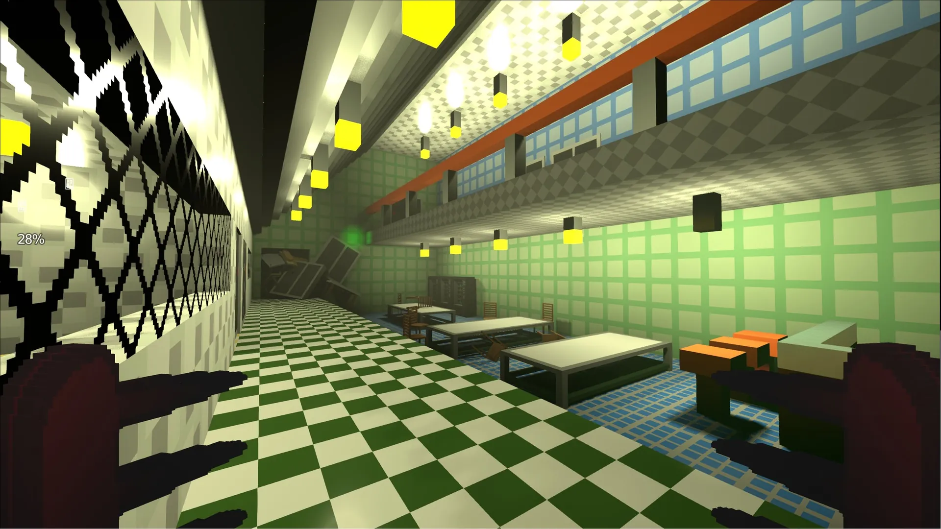
Contestant in the SA Game Jam, participants were required to create a playable video game centered around "you are the monster" in less than 3 days.
"Embracing Humanity" was created solo using Godot, Blender, and MagicaVoxel to create 3D models, animate, and create custom sounds without using any asset packs.
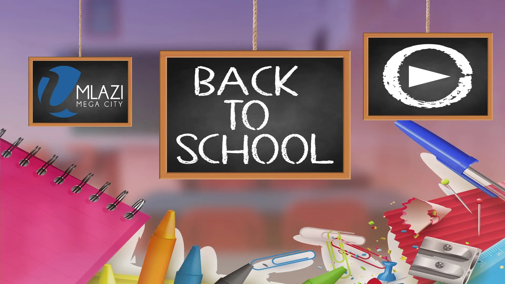
Designed and developed an interactive back-to-school interactive kiosk video game for Umlazi Megacity customers, featuring dynamic music and custom transitions.
All original assets and code were created to meet a tight deadline of 48 hours.
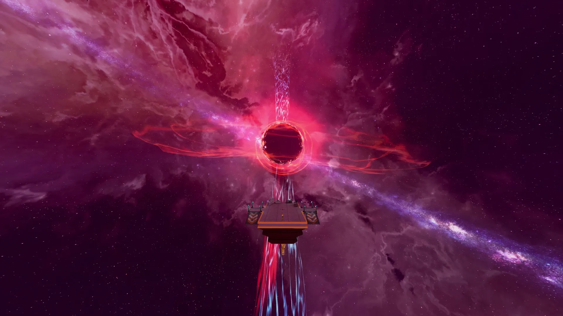
Reimagined the arena "Q3DM17" from the 1997 game "Quake 3 Arena" in the Source Engine using the Black Mesa SDK.
Worked with (at-the-time) undocumented custom features designed for Black Mesa, to create a unique spin on the classic level.
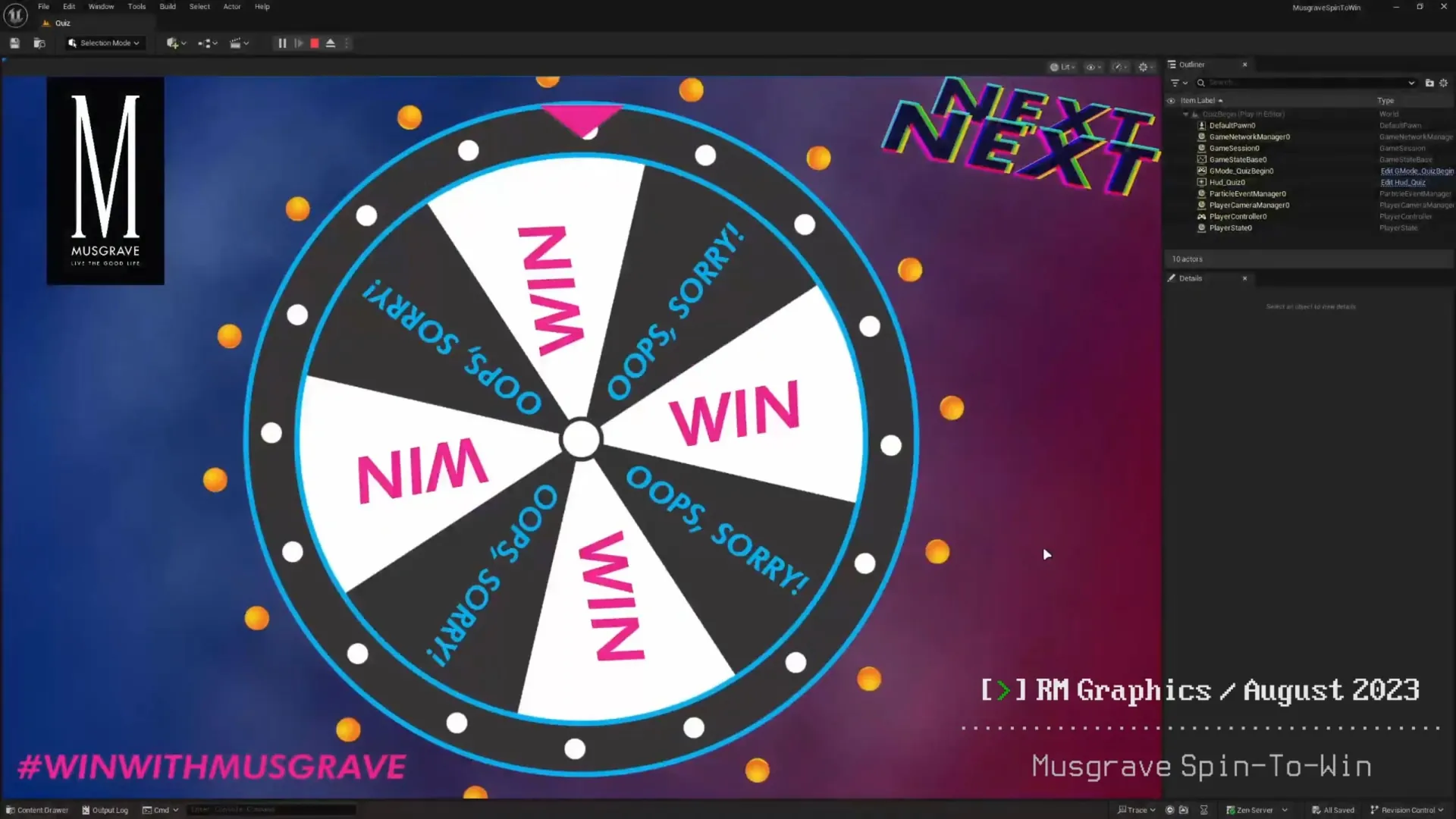
Created a spin-to-win interactive kiosk game for Musgrave Center shoppers, designed and animated in Unreal Engine 5.
This project showcased interactive game mechanics for retail engagement and customer experience enhancement.
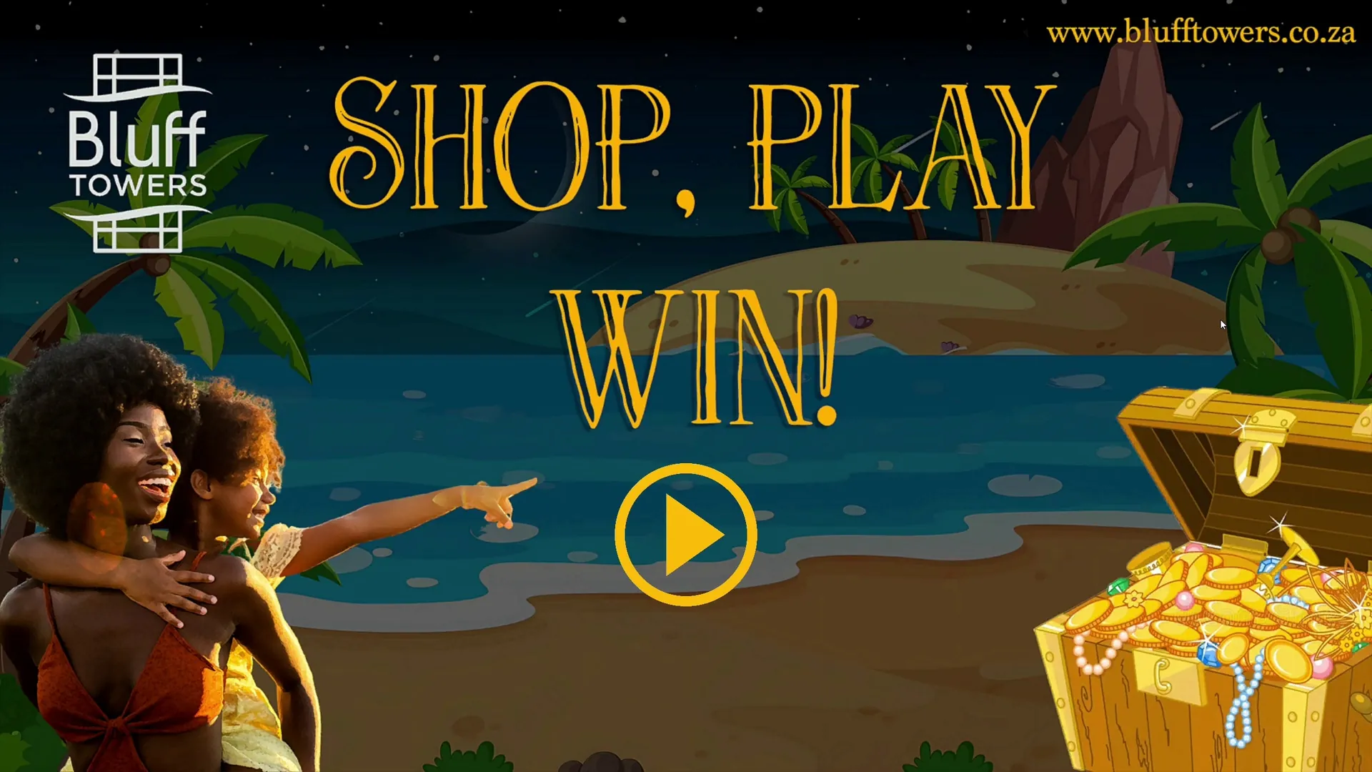
Successfully delivered a pirate-themed interactive kiosk game for Bluff Towers shoppers, a project commissioned directly as a result of the client's satisfaction with the previous game developed for Musgrave Center.
Customers that spent over a threshold at the mall would play a game involving locating the pirate's treasure; if done successfully, the customer would receive a prize.
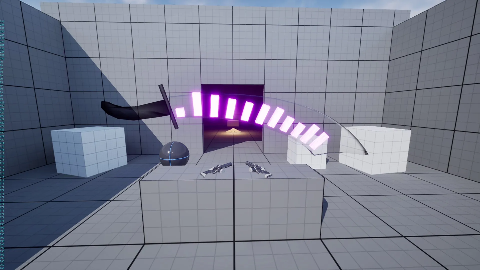
Prototyped various mechanics for a VR experience, including UE Blueprints, a 3D environment that dynamically reacts to music, and melee weapon handling.
Explored immersive interaction systems and environmental storytelling techniques for virtual reality applications.